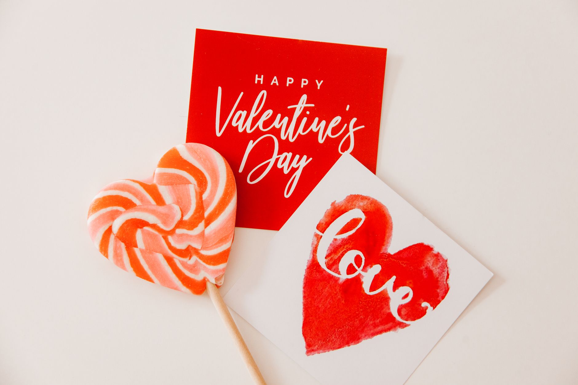
Yes, you can make an appealing Valentine’s card without red paper. Use pink, purple, white, cream, blue, kraft, or patterned paper to create a design that feels personal and festive.
Explore colour combinations, paper alternatives, and familiar Valentine motifs such as hearts, flowers, envelopes, and handwritten notes. Simple techniques like layering, folding, stitching, or adding stickers can give your card texture and visual interest.
Your message matters as much as your materials. Choose words that suit the person you’re celebrating, and use color and decoration to make the card feel distinctly yours.
Color Palettes Beyond Red
You can create attractive Valentine’s cards with pink, white, beige, gray, blue, green, or metallic accents instead of red paper. Choose one main color, add one supporting shade, and use contrast through ink, ribbon, stitching, or lettering.
Classic Pink And White
Pink and white create a recognizable Valentine’s palette without relying on red. Use pale pink cardstock as the base, then layer white shapes, labels, or heart cut outs for contrast. For a stronger design, combine blush paper with bright white lettering and a few darker pink details.
Try these combinations:
- Blush pink, white, and dusty rose for a soft appearance
- Peach pink, ivory, and coral for a warmer design
- Fuchsia, white, and pale pink for higher contrast
You can make hearts from white watercolour paper, vellum, or patterned scrapbook paper. Add pink ink, baker’s twine, or stitched outlines to connect the layers. Keep the sentiment short, such as “You’re Loved” or “Be Mine,” so the open space remains part of the design.
Elegant Neutrals And Metallics
Neutral colors give your card a clean, polished look. Start with kraft, cream, taupe, gray, or black cardstock, then add metallic details in gold, silver, or copper. Kraft paper works especially well with white lettering and a simple stitched heart.
Use cream and gold for a warm, refined card. Choose charcoal, ivory, and silver when you want sharper contrast, or pair beige, black, and copper for a modern design. Metallic paper can form a single heart, border, or small banner; using it sparingly keeps the card balanced.
Add texture with linen ribbon, deckled paper edges, embossed lettering, or white gel-pen details. A neutral card also gives you room to personalize the message with a handwritten note inside.
Bold Nontraditional Combinations
Strong color combinations can make your card distinctive without using red or pink. Pair navy with pale blue and white for a crisp, winter-inspired design. Combine teal, mustard, and cream for a cheerful handmade card, or use plum, lavender, and metallic gold for a richer palette.
Choose one dominant color for the card base and limit the accents to two additional shades. For example, use navy cardstock with white lettering and three pale-blue hearts. You can cut geometric hearts, paint abstract shapes, or layer solid paper with patterned pieces.
Green also works well when you use muted shades such as sage and eucalyptus. Add ivory lettering and a small gold accent to create a botanical Valentine’s theme without making the card look like a holiday design.
Cardstock And Paper Alternatives
You can make attractive Valentine’s cards with soft colors, natural brown stock, recycled paper, or printed sheets. Choose paper that folds cleanly, supports your decorations, and gives your message enough contrast to remain easy to read.
Pastel Construction Paper
Pastel construction paper gives you color without relying on red. Try pink, lavender, peach, mint, pale blue, or yellow for the card base, then add contrasting shapes or lettering. Fold the sheet in half and press the crease with a ruler for a sharper finish.
Construction paper works best for lightweight cards. If it feels flimsy, glue it to a piece of cardstock or fold two sheets together. Use a glue stick to reduce warping, and let the card dry under a book for a few minutes.
Pair a pale base with dark accents such as navy, charcoal, brown, or black. White gel pens also stand out on darker pastel shades. You can cut hearts from leftover paper, layer smaller shapes over larger ones, or write a simple message directly on the front.
Kraft Paper And Recycled Stock
Kraft paper creates a warm, understated card with a natural brown surface. Use a kraft card blank, a paper grocery bag, or clean packaging, but avoid materials with grease, moisture, or heavily coated surfaces. Mount thin recycled paper onto cardstock so the finished card holds its shape.
Decorate kraft paper with white, cream, yellow, teal, or purple accents. A white paint pen can create lettering, while paper scraps can form hearts, flowers, or geometric patterns. Newspaper, magazine pages, old maps, and used wrapping paper also add texture and visual interest.
Check that reused paper has a clean back if you plan to write there. If not, glue it to a blank cardstock panel and leave a plain area inside the card for your message.
Printed And Patterned Sheets
Printed paper can serve as the main design, so you don’t need a red card base. Choose floral prints, stripes, polka dots, geometric patterns, or pages from an old calendar. Use a heavier sheet for the outer card, or attach the printed paper to cardstock for better durability.
Keep the message readable by placing it on a plain label or light-coloured panel. You can cut one large heart from the patterned sheet, create several small shapes, or use the print as a border around a solid centre.
When combining patterns, limit the design to one dominant print and one simple accent. Trim the edges with a ruler and craft knife or use decorative scissors for a softer border. Test your adhesive on a scrap first, especially with glossy paper.
Valentine Motifs That Need No Red
You can create recognizable Valentine designs with pink, purple, blue, white, yellow, green, kraft, or patterned paper. Focus on familiar symbols, balanced colour combinations, and small details such as handwritten messages, ribbon, stamps, or punched shapes.
Hearts In Alternative Colours
Choose heart colours that match the message you want to convey. Pink creates a soft, friendly look, while purple feels creative and slightly more formal. Blue works well for friendship cards, and yellow adds a cheerful, playful quality. White hearts on navy or kraft cardstock create strong contrast without looking traditional.
Layer three heart shapes in different sizes, then attach them with foam adhesive for dimension. You can also cut hearts from floral paper, newspaper, watercolour scraps, or pages from an old book. Add a short phrase such as “You brighten my day,” “Best friends,” or “With love” instead of relying on colour to communicate the theme.
Floral And Botanical Designs
Use flowers, leaves, and vines as the main decoration rather than a heart. Draw simple daisies with white petals and yellow centres, stamp lavender sprigs in purple ink, or cut green leaves from cardstock and arrange them around your message. A pale blue background with white flowers gives the card a clean, winter-to-spring appearance.
For a quick handmade design, attach a pressed flower or a small paper botanical cut out to the front. Secure delicate pieces with craft glue and write the greeting beside them. You can also use floral wrapping paper as a panel, then mount it on a solid card base in cream, sage, lavender, or light blue.
Cupid, Birds, And Sweet Treats
Cupid doesn’t need a red outfit. Draw the figure in gold, purple, blue, or black, and use a white or pastel heart-shaped arrow tip. A simple silhouette keeps the design clear: include a bow, wings, and arrow, then place a short greeting beneath the image.
Lovebirds, doves, and paired penguins offer friendly alternatives to romantic symbols. You can also feature cupcakes, macarons, candy hearts, or a hot chocolate mug in pastel colours. Use small details such as sprinkles, striped straws, or speech bubbles to establish the Valentine theme, with messages like “You’re sweet” or “Glad you’re my friend.”
Design Techniques And Embellishments
You can create a balanced Valentine’s card with colour, contrast, and texture instead of traditional red paper. Layered shapes, hand-drawn details, stamps, ribbon, stickers, and tactile materials help you personalize the design while keeping the message easy to read.
Layering And Collage
Start with a neutral card base such as white, cream, kraft, grey, or black. Add two or three paper layers in colours such as pink, lavender, peach, blue, mint, gold, or patterned scrapbook paper. Keep the largest layer flat, then attach smaller shapes with glue or foam adhesive to create controlled dimension.
Cut hearts, initials, flowers, envelopes, or speech bubbles from leftover paper. Combine solid colours with one pattern so the design does not look crowded. Arrange the pieces before gluing, and leave a small border around each layer to make the shapes distinct.
Useful layout choices:
- Place one large heart slightly off-centre.
- Repeat three small shapes in a row.
- Frame the message with contrasting paper.
- Use white space around the focal point.
Markers, Paint, And Stamps
Use dark markers on light paper for clear lettering, or choose a white gel pen for black, navy, or kraft cardstock. Write the main message first with a pencil, then trace it with a fine-tip marker. Short phrases such as “With love” fit well on small cards.
Add painted dots, loose stripes, tiny flowers, or watercolour washes around the edges. Let wet paint dry before adding ink so the lines remain sharp. Rubber stamps can provide consistent hearts, letters, or botanical motifs; test the stamp on scrap paper first to check ink coverage and alignment.
Ribbon, Stickers, And Texture
Attach a narrow ribbon vertically, tie it around the card like a parcel, or make a small bow near the message. Use glue dots or strong double-sided tape to secure the ends on the card’s back. Flat ribbon works best for cards that need to fit inside standard envelopes.
Choose stickers that support the colour scheme, such as gold stars, pastel hearts, alphabet letters, or clear botanical designs. For texture, add a small piece of lace, felt, corrugated paper, tissue paper, or a paper doily. Limit bulky embellishments near the fold and test the finished card in its envelope before adding more.
Personalizing The Message
Choose words that match your relationship, the recipient’s age, and the card’s design. You can write a meaningful message on white, pink, purple, blue, yellow, green, or patterned paper; the message matters more than the colour.
Romantic Notes
Mention a specific quality, memory, or routine that makes your relationship meaningful. For example: “I love how you make ordinary evenings feel special,” or “I still smile when I think about our walk by the lake.” Specific details sound more sincere than broad phrases such as “You’re the best.”
Match the message to your relationship. A new partner may appreciate a warm, simple note, while a long-term partner may enjoy an inside joke or a reference to a shared experience. You can also write a short message on the front and add a longer note inside.
If the card uses blue or lavender paper, let the writing create the romantic focus. Use a dark pen for contrast, then add a small heart, star, or floral detail without covering the words.
Friendship Messages
Focus on appreciation, shared experiences, and the qualities you value in your friend. You might write, “Thank you for always listening without judgment,” or “Our weekend trips give me some of my favourite memories.” These messages work well on cards made with green, orange, yellow, or patterned paper.
Add a brief detail about the future, such as planning coffee, a movie night, or another activity you both enjoy. Your handwriting, a small doodle, or a short list of shared interests can make a simple card feel distinctive.